Mary Mechanix
Mary Mechanix was a multilayered cannabis business that handled all parts of the trade from grower, producer, distributor and seller. This client originally wanted a pin-up style woman to be the face of their brand. The client had lofty hopes for their pin-up girl to be posed differently and in various looks for each strain they offered, which numbered upwards of thirty different strains. After the first trial attempts, the client decided that their budget and timeline wouldn't allow for this and, therefore, we needed to re-evaluate.
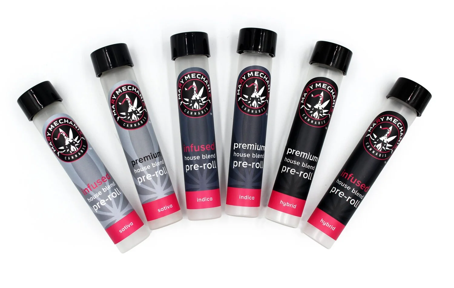
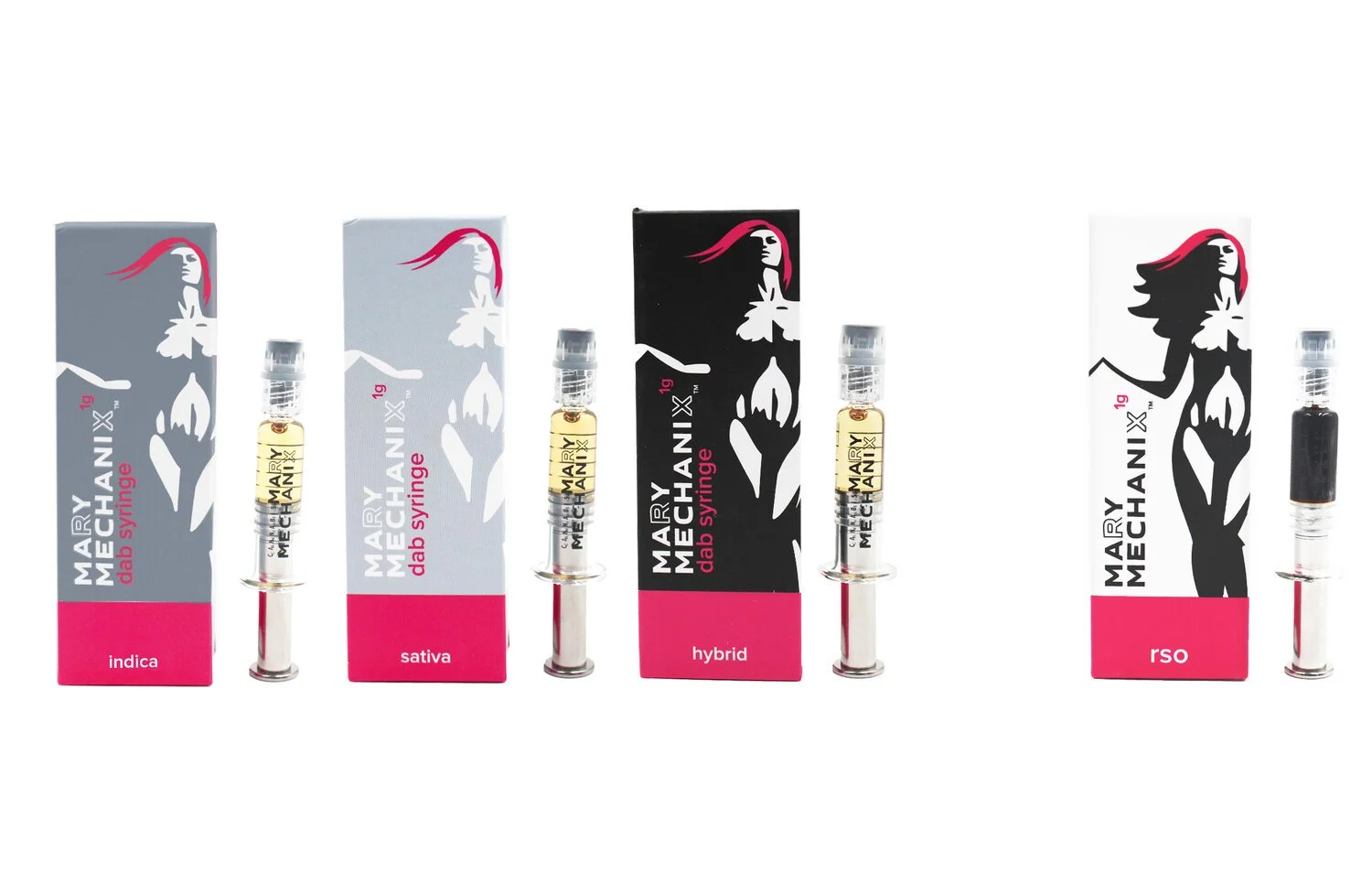
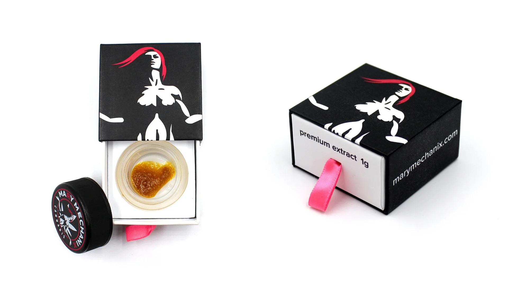
To keep the name and garage motif, the icon pivoted from a pin-up girl to a simplified and timeless goddess. She is easy to imagine standing proudly while out stretched at the front of the hood of a classic luxury car. Thus, Mary was born. The choice of color was a modern and bright pink to stand out in the sea of green that one typically sees in the cannabis industry. A bright pink paired with black added a level of lustrous and sleek element to the design while not over complicating the brand.