
Package Design
Package design is vital as it is the first impression a product will make on its consumer. Using attractive packaging design will help you stand out among competitors. It works to tie together all elements from form, color, imagery, typography and product information to support each of these components to make the product marketable.
Each product has it own voice, I hear the voice that the client wants the product to have and give each a face with its own characteristics. Packaging gives the brand the opportunity to enter the physical world and touched by the consumer.


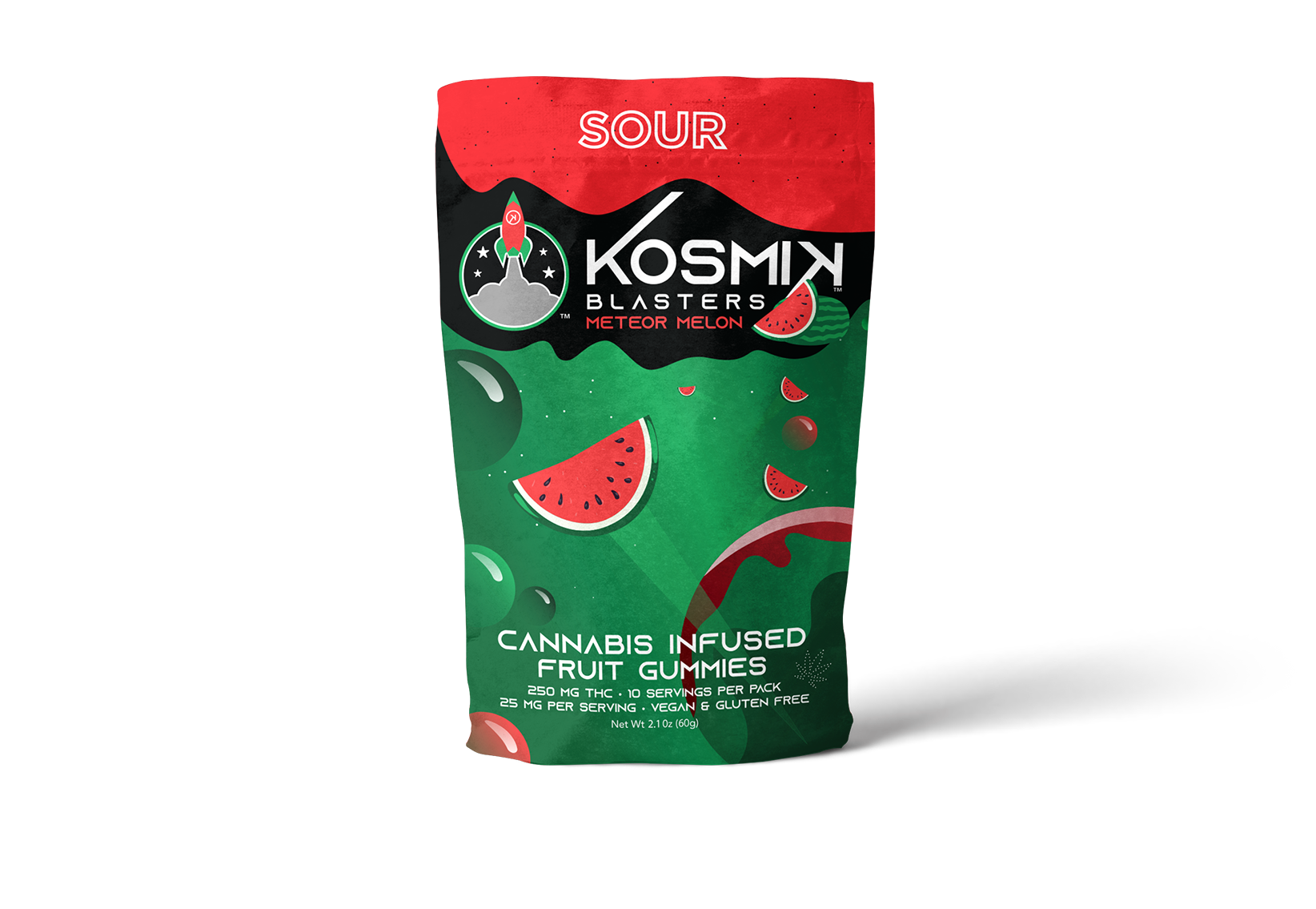
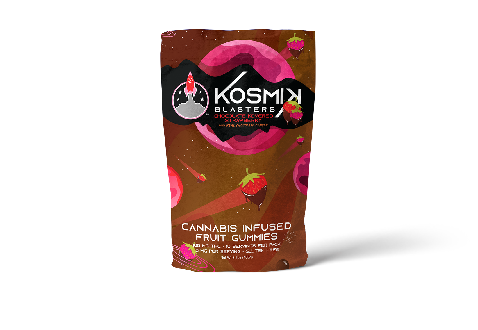
Kosmik Brands
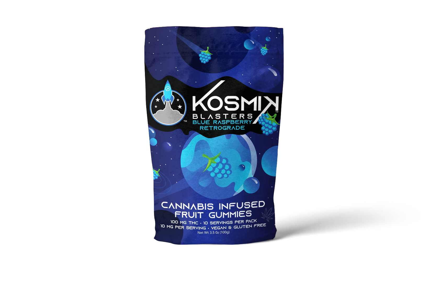
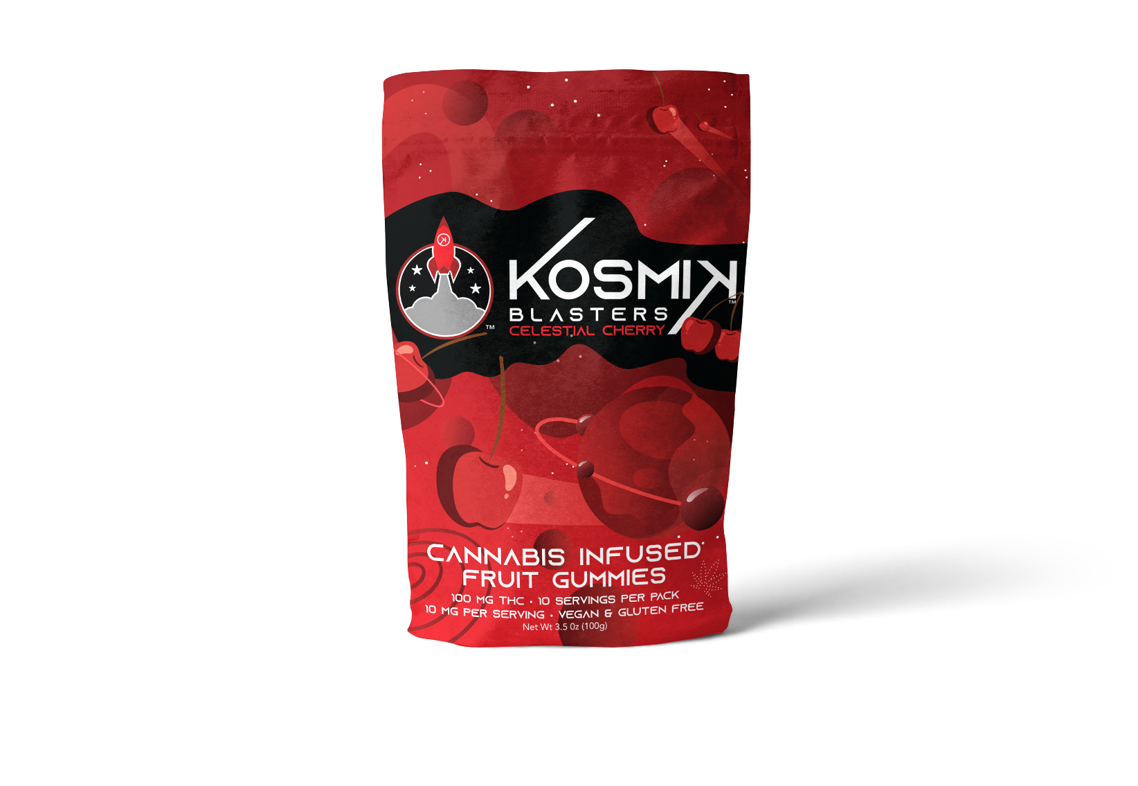
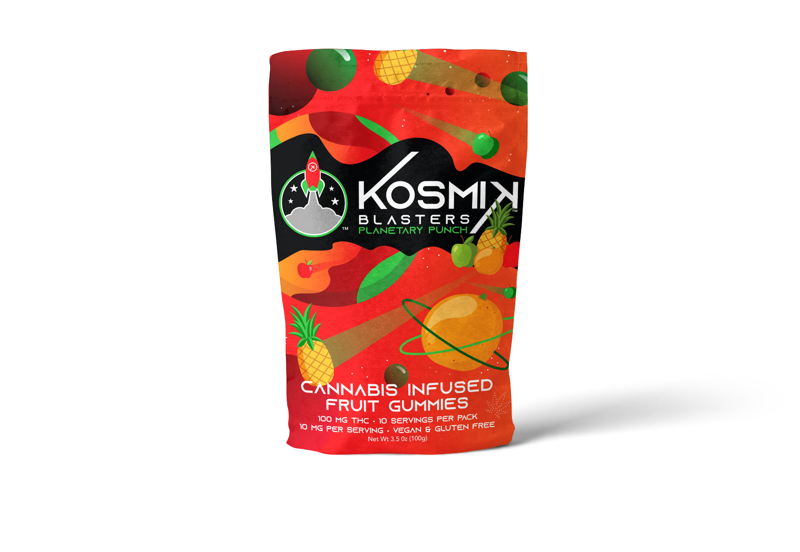
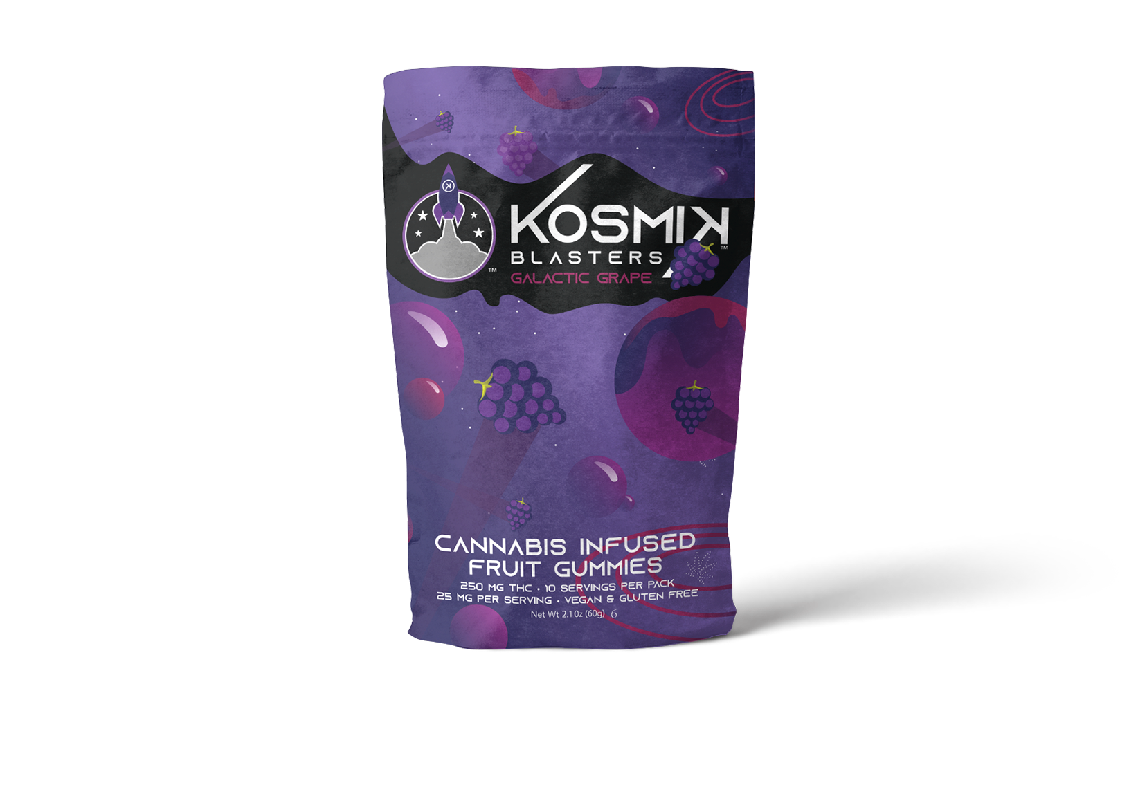
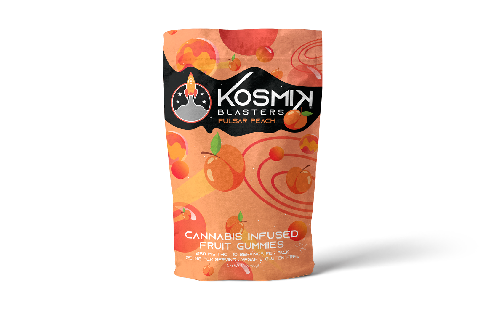
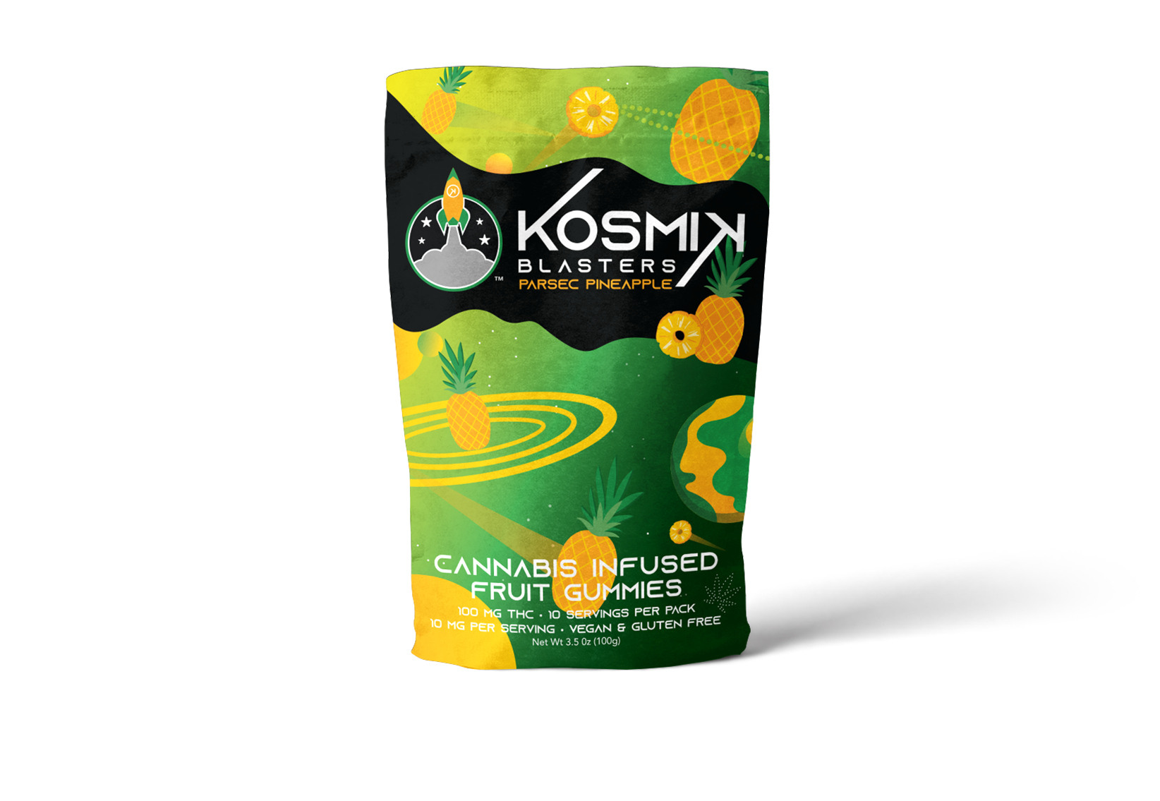
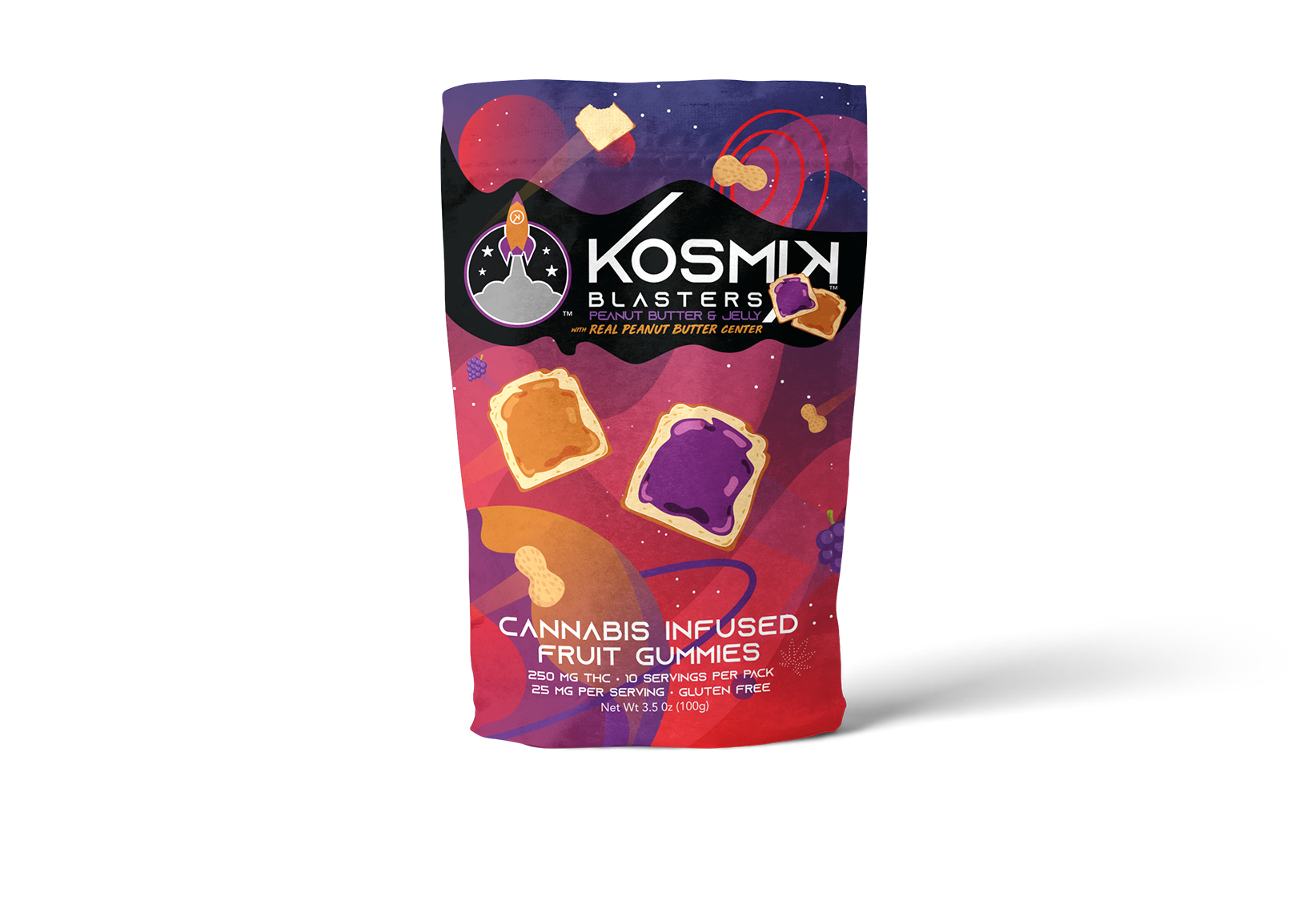
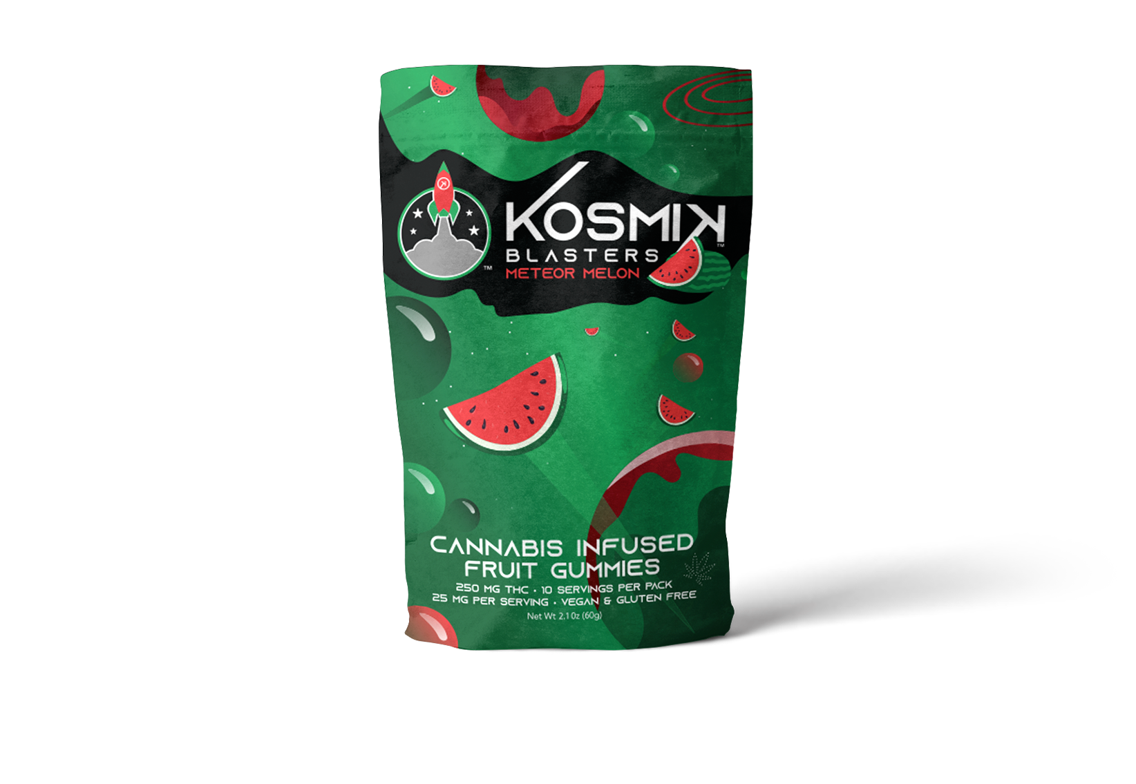
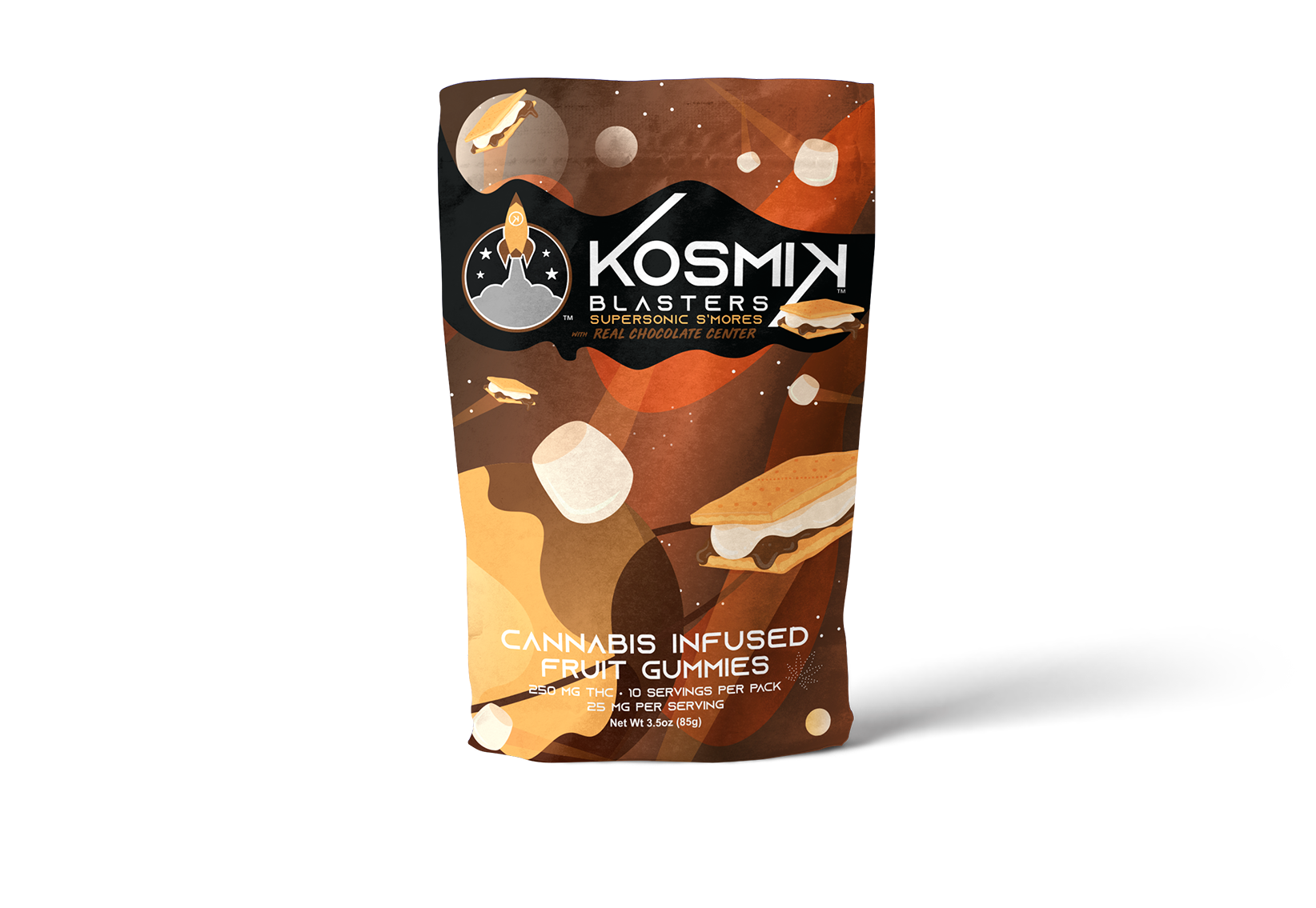
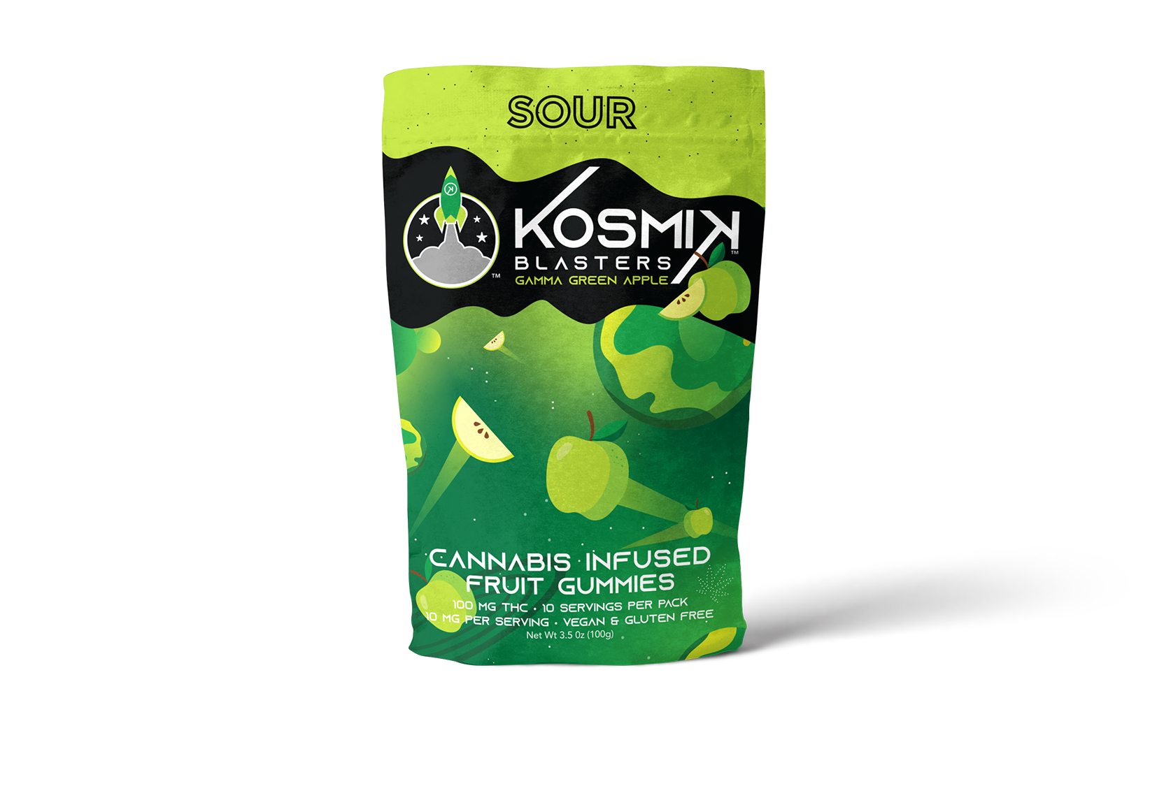
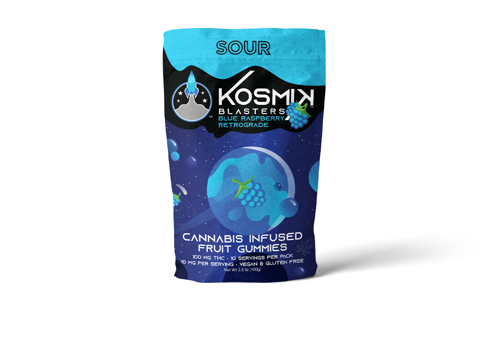
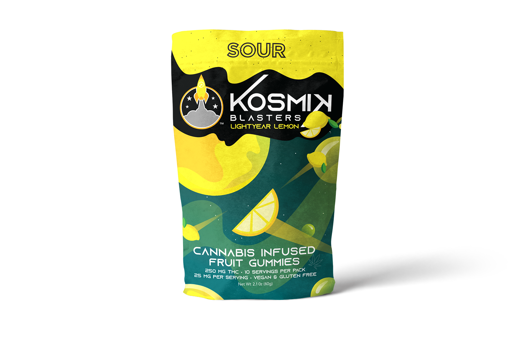
Kosmik Brands is a producer of cannabis infused gummies that creates an "out-of-this-world" product. This client wanted fun and colorful graphics with a space theme for a variety of flavors. The flavors range from general, sour and specialty.
By using vibrant colors for each bag, it allows for all to have a distinct color palette (influenced by its flavor) while creating a cohesive aesthetic. By adding a futuristic font and a dynamic fruit space scene the result created a tasty combination.


My Cup Case
Leaky Lady is a hygienic travel case for a woman's menstrual cup providing a reusable, sustainable & budget-friendly option. They were in need of vivacious and feminine packaging, which was achieved through tropical floral elements with simple flat vector imagery.
The three product colors (turquoise blue, lavender and peachy orange) were integrated into the design with a combination of other lush radiant colors to unity the product and packaging seamlessly.

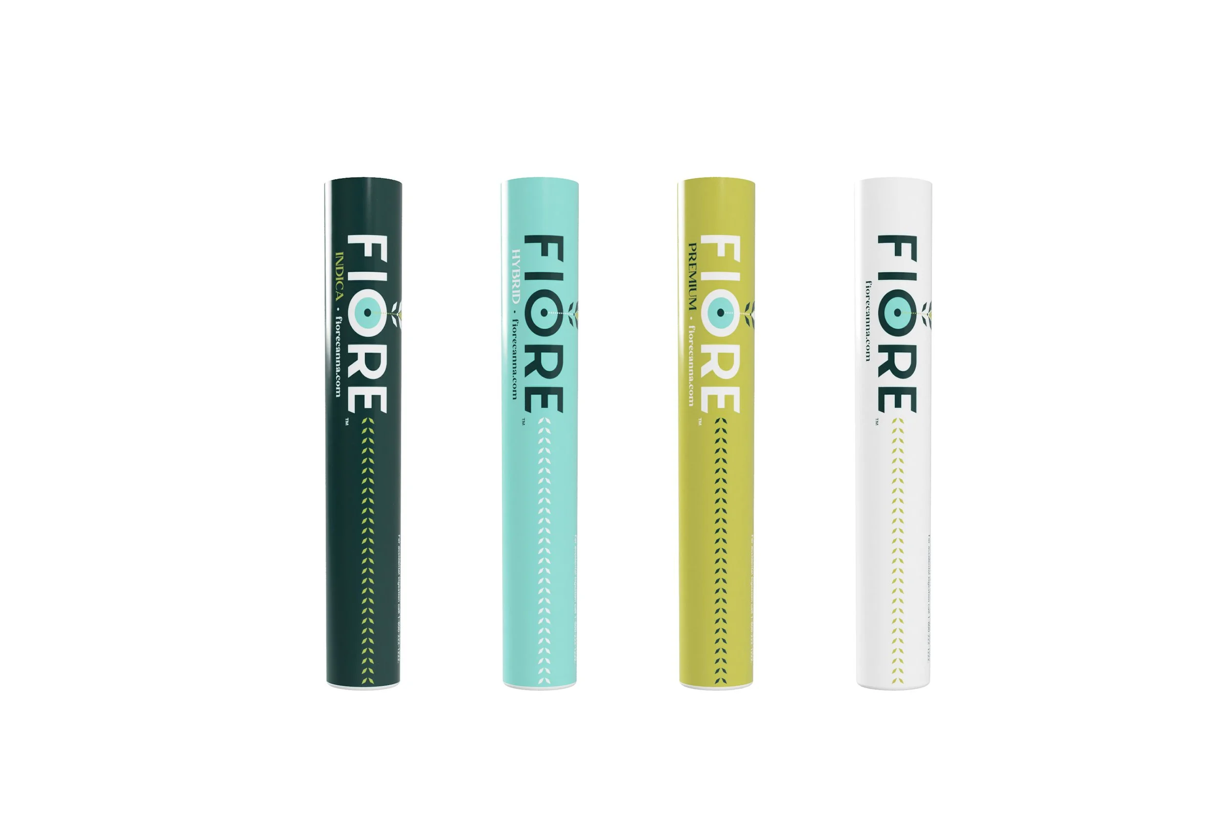
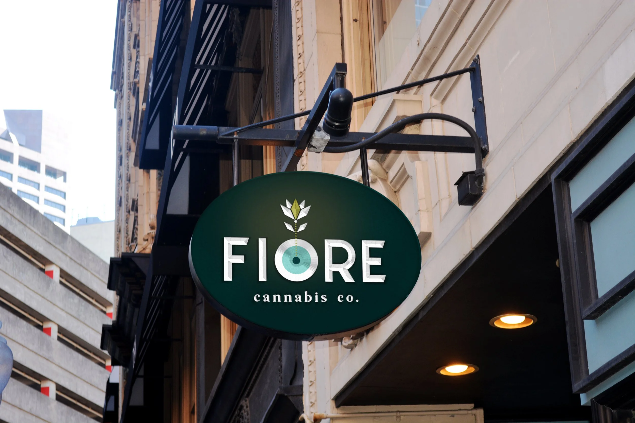

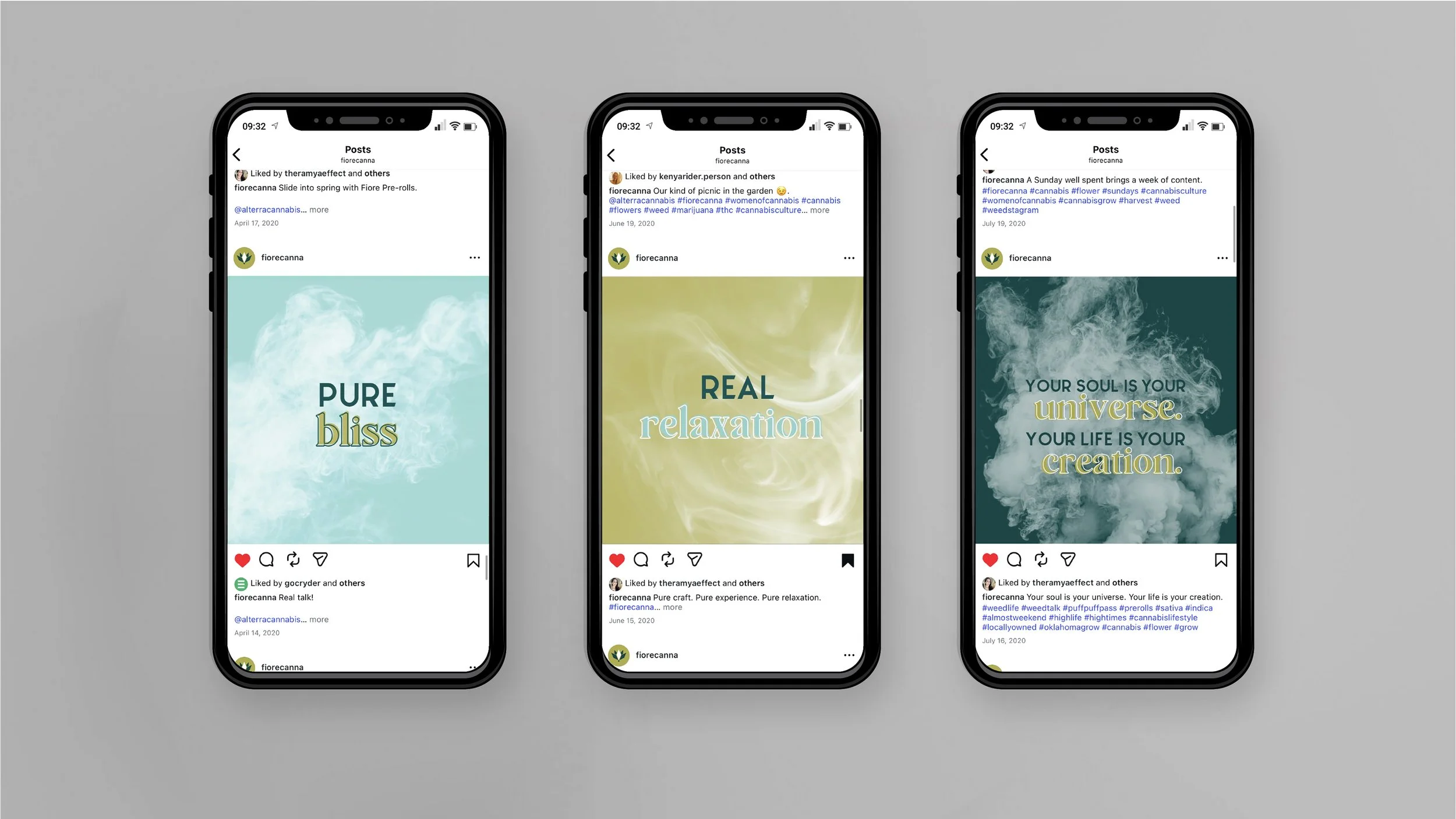
Fiore Cannabis
Fiore is Italian for "flower." A common nickname of cannabis, echoing its most natural state. Harvesting the freshest flowers is the goal of this craft cannabis company. Our objective for this client was to create a brand that reflects the pure experience they grow with each plant. They use contemporary methods such as growing their plants hydroponically indoors while keep the natural and garden quality to each growth.
Their brand reflects the combination they create of quality craft and contemporary, intertwining the two aspects in their product. This is exemplified in a modern geometric flower sprouting from a strong and timeless font. The colors reflect the earthly quality of their cannabis in a fresh color palette. The light blue-green symbolizes the life-giving water. The dark impactful teal represents the ground the seed sprouts from. The golden chartreuse implies the light that brings forth the growth of each plant.
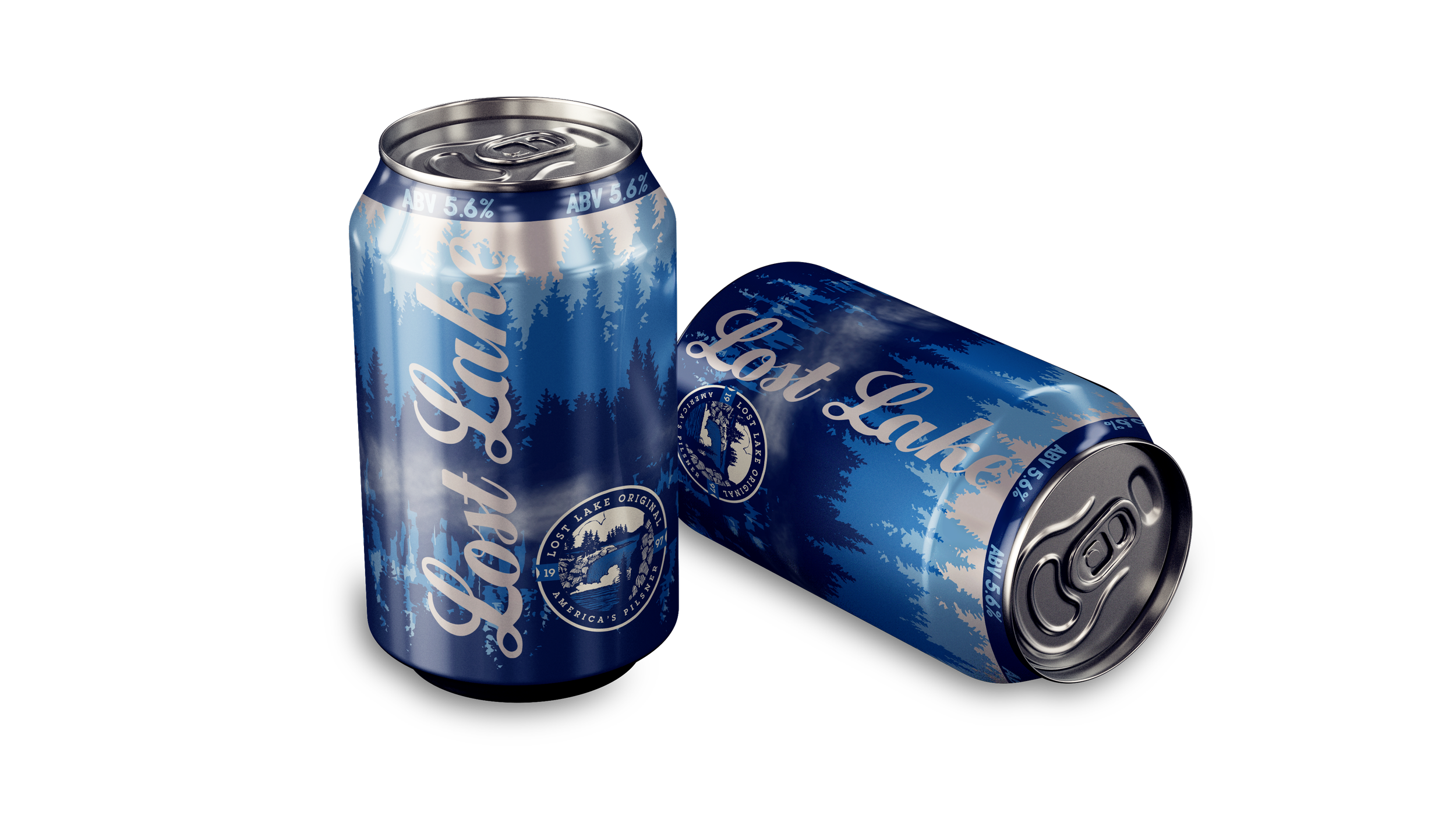
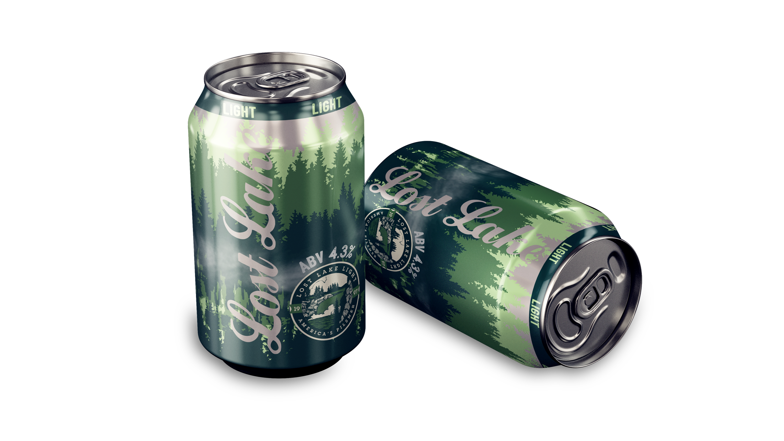
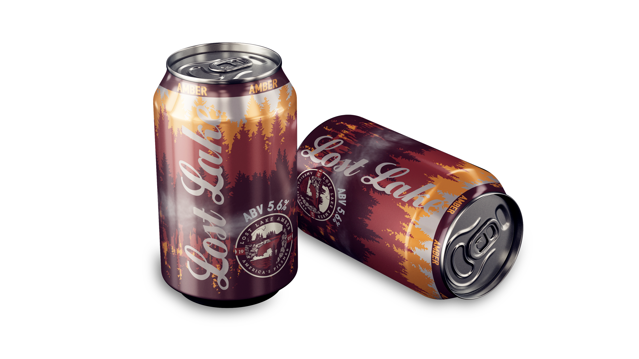
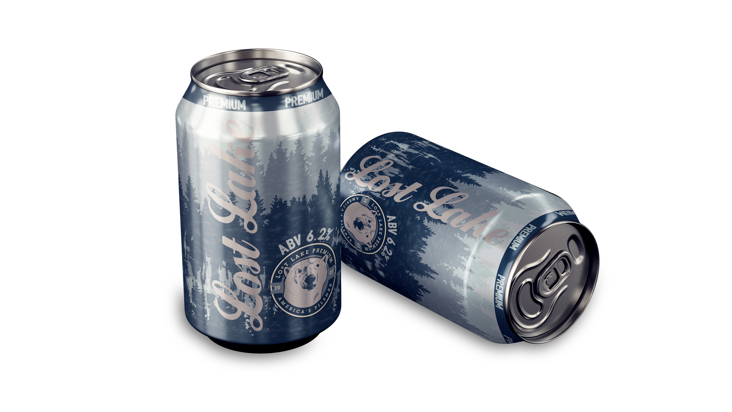
Lost Lake
Lost Lake is the hometown beer that you have with friends out on a lake. While fishing with your buddies, you accidentally scare away all the fish from the sounds of laughter and clinking of cans in cheers.
The colors and imagery reflect not only the different variety of beers, but also the seasons each of these beers personify: Light - a refreshing spring, Original - the height of summer, Amber - a crisp autumn, and lastly Premium - a frosty winter.
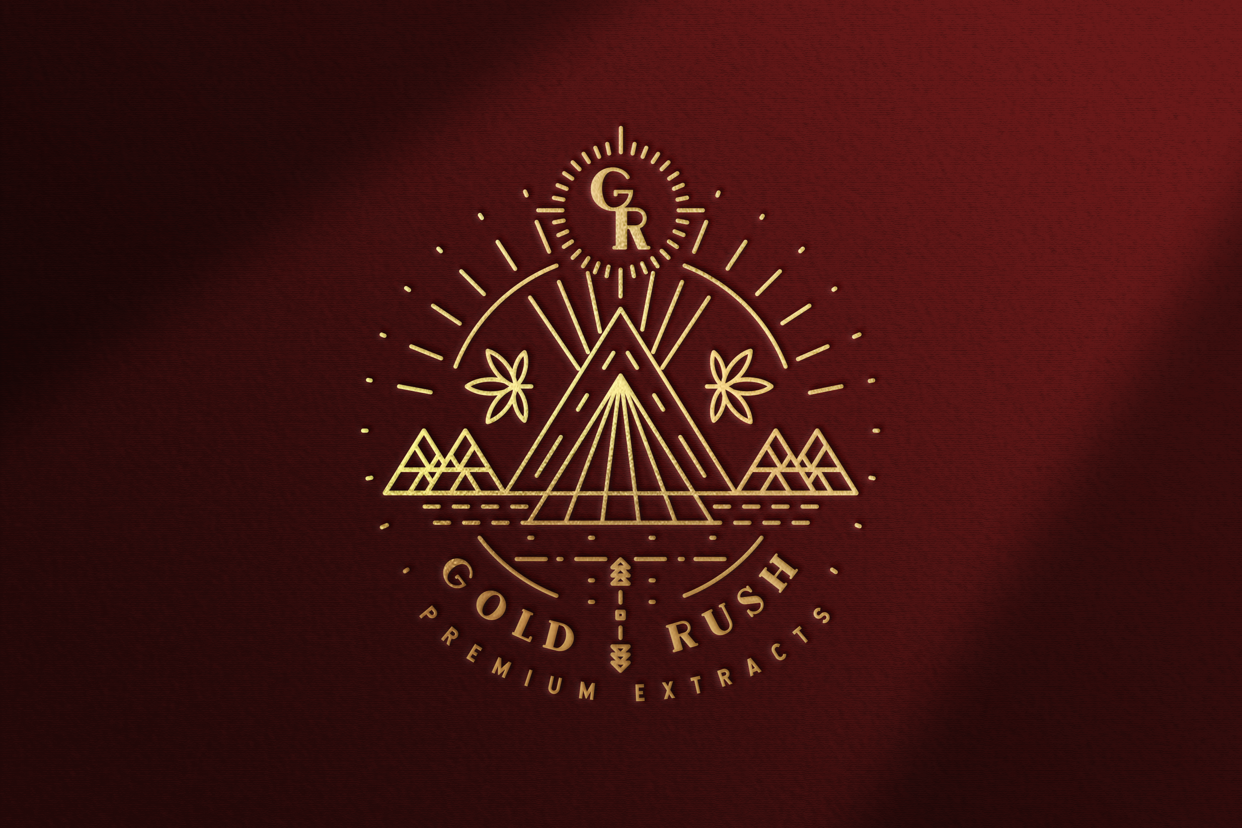
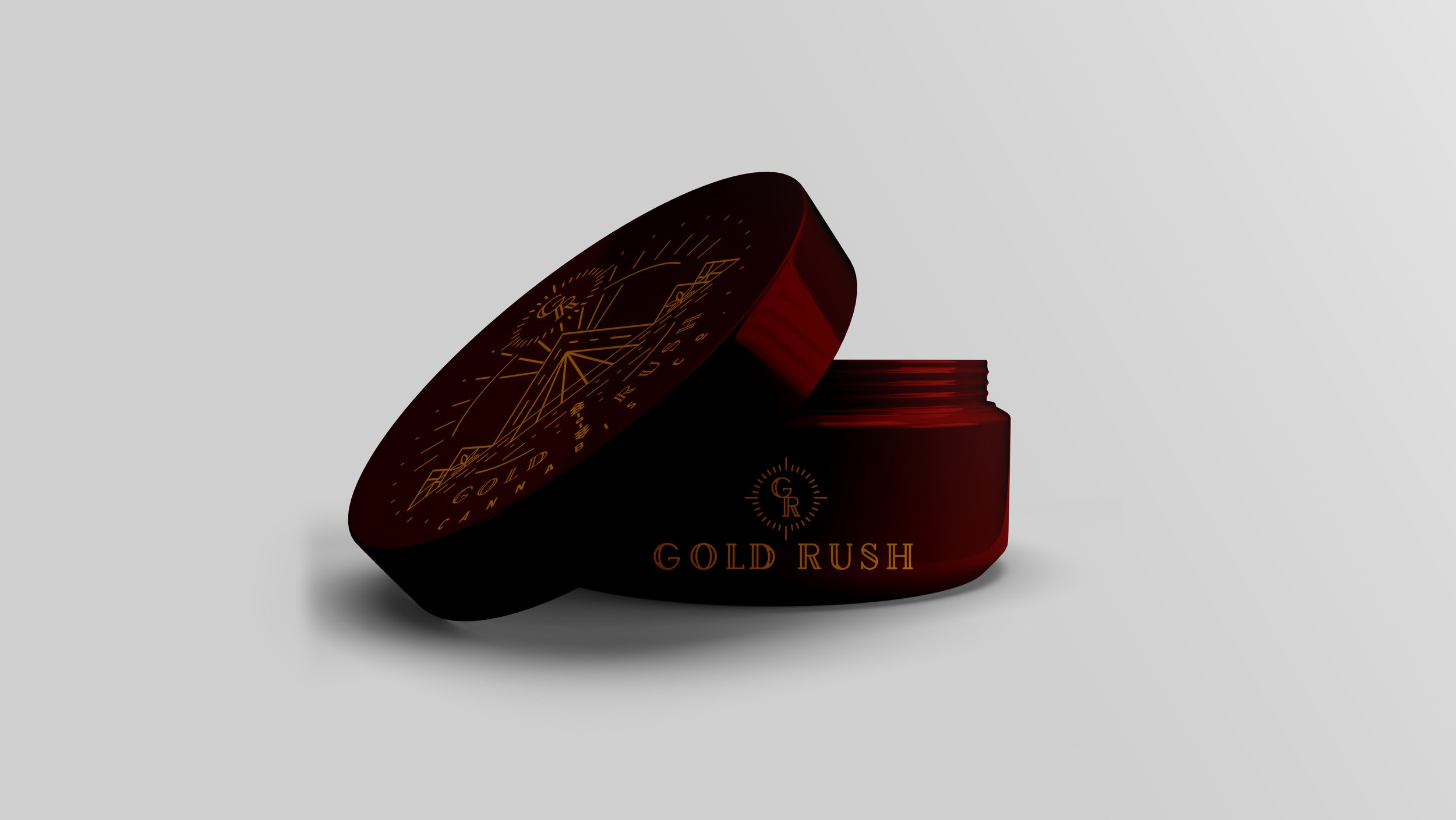
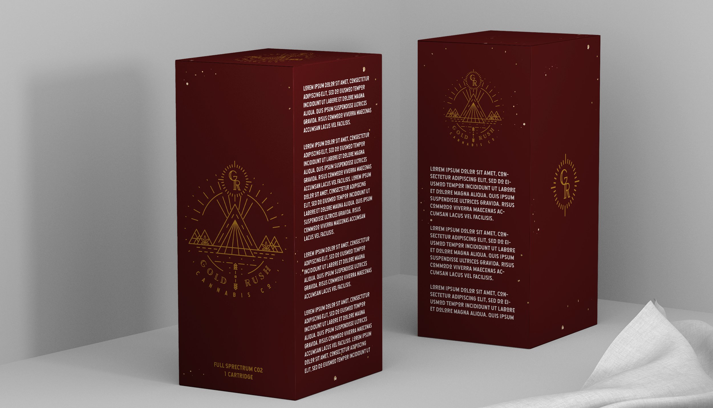
Gold Rush
Gold Rush is a cannabis company committed to providing their clientele with premium cannabis extractions. Their focus is to provides their clients with a product that will make them feel like they are living in the Golden Age. The goal for this client was to bring to life a modern and lavish brand paired with packaging that matches the sophistication.
A deep maroon was used to invoke a strong personality and sense of importance. Gold produces an air of prestige and high-end luxury. The specs of foiled gold on the packaging imitates gold before unearthed. The imagery uses modern line work in combination with elements inspired by the 1850s Gold Rush (the namesake of the brand) to produce an exclusive quality.